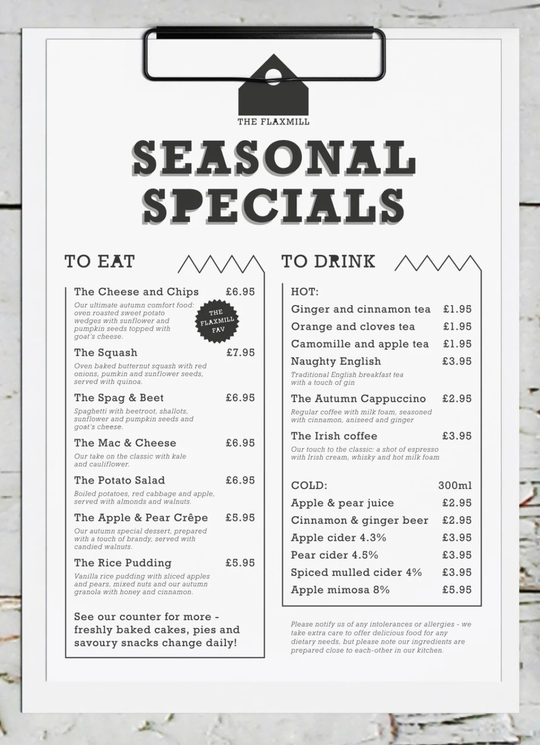
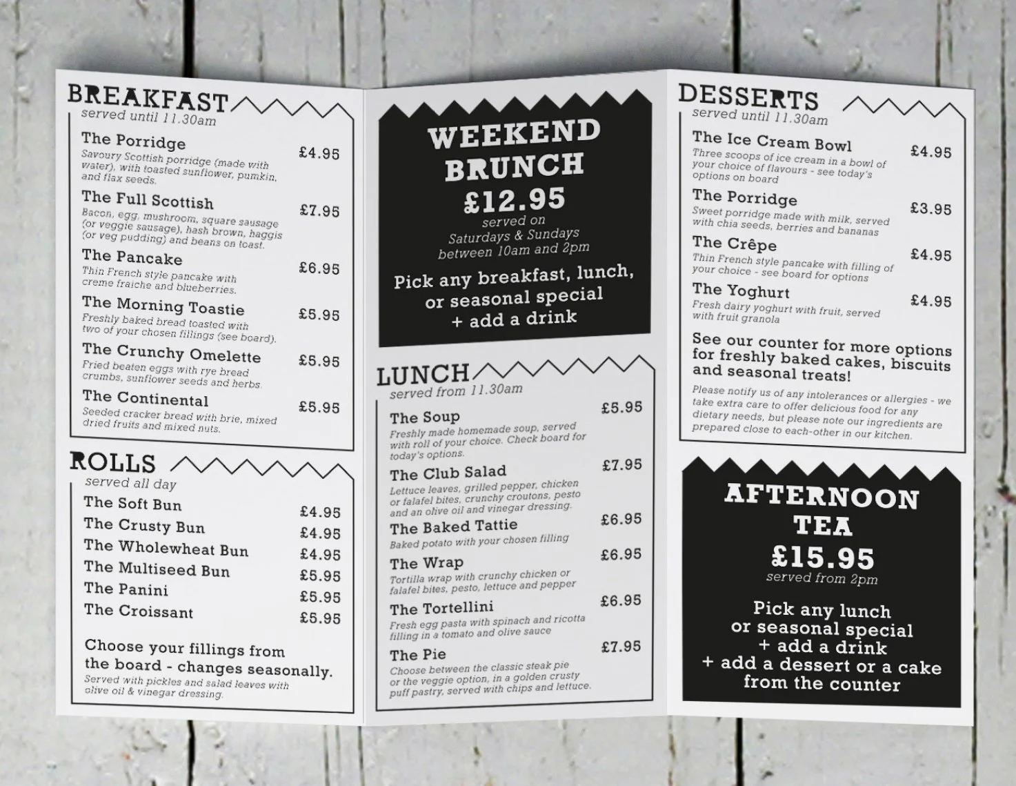
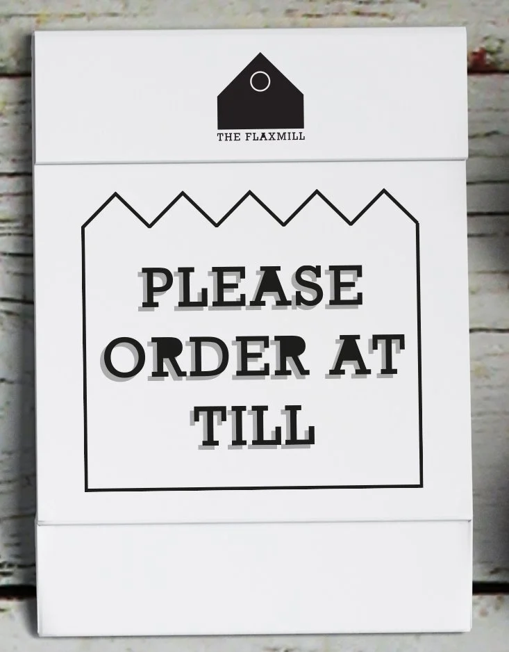
The Flaxmill was also created for the packaging company offering branding on their environmentally friendly materials. The brand identity of The Flaxmill relates to the built environment: the café is part of a disused flax mill building in Fife, with very distinctive shapes and roofing elements.
I wanted to compliment it with a logo and an industrial-looking typeface that is easy to recreate and can be edited and printed on small office equipment too. I considered the benefits of simplicity for the packaging and menu designs, and kept a singoe-colour, cost-efficient printing in mind too.
good design should always BE driven by considerations towards the end user, in this case, the customers of these places - how would they use these designs? would they want to meet here? these are the most important to consider in the process of creating things that last.