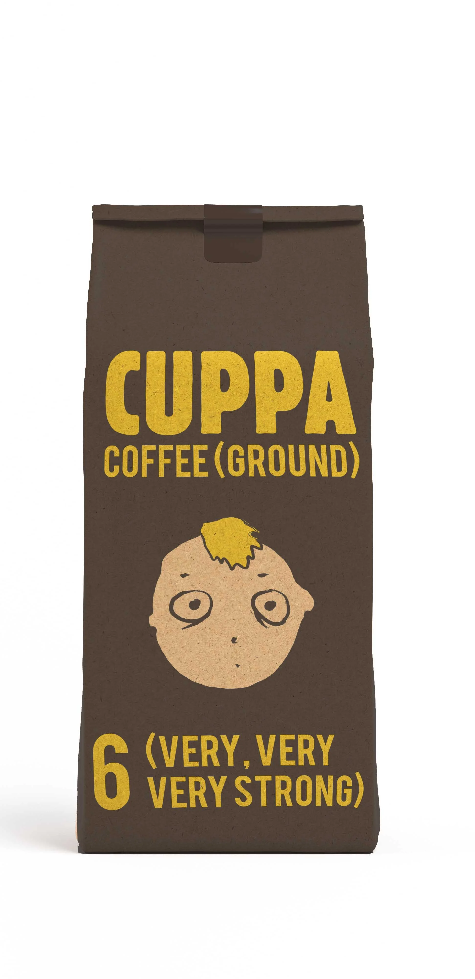
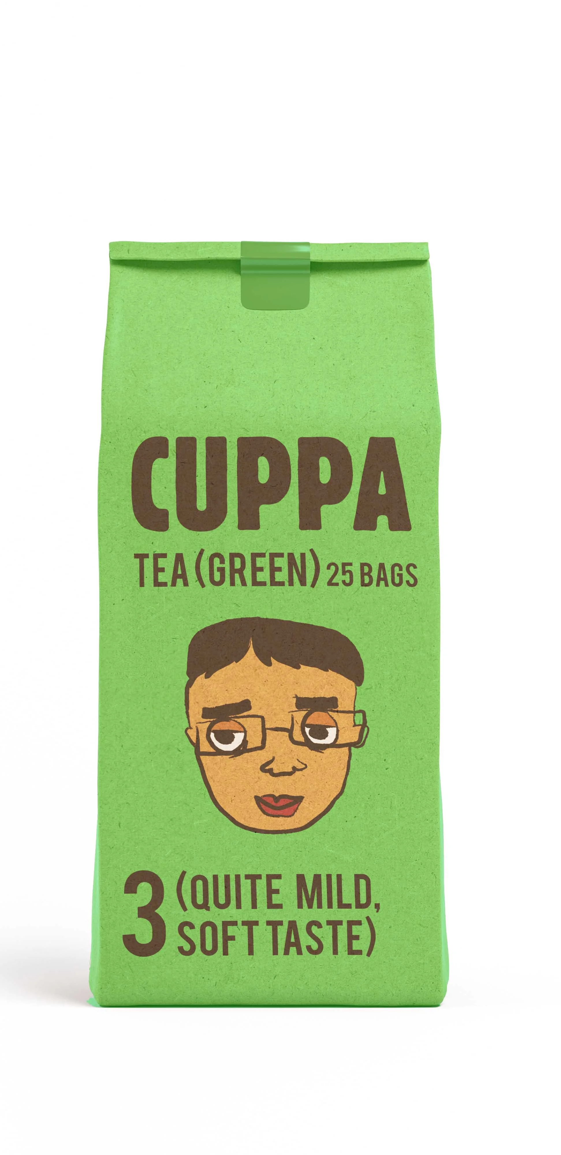
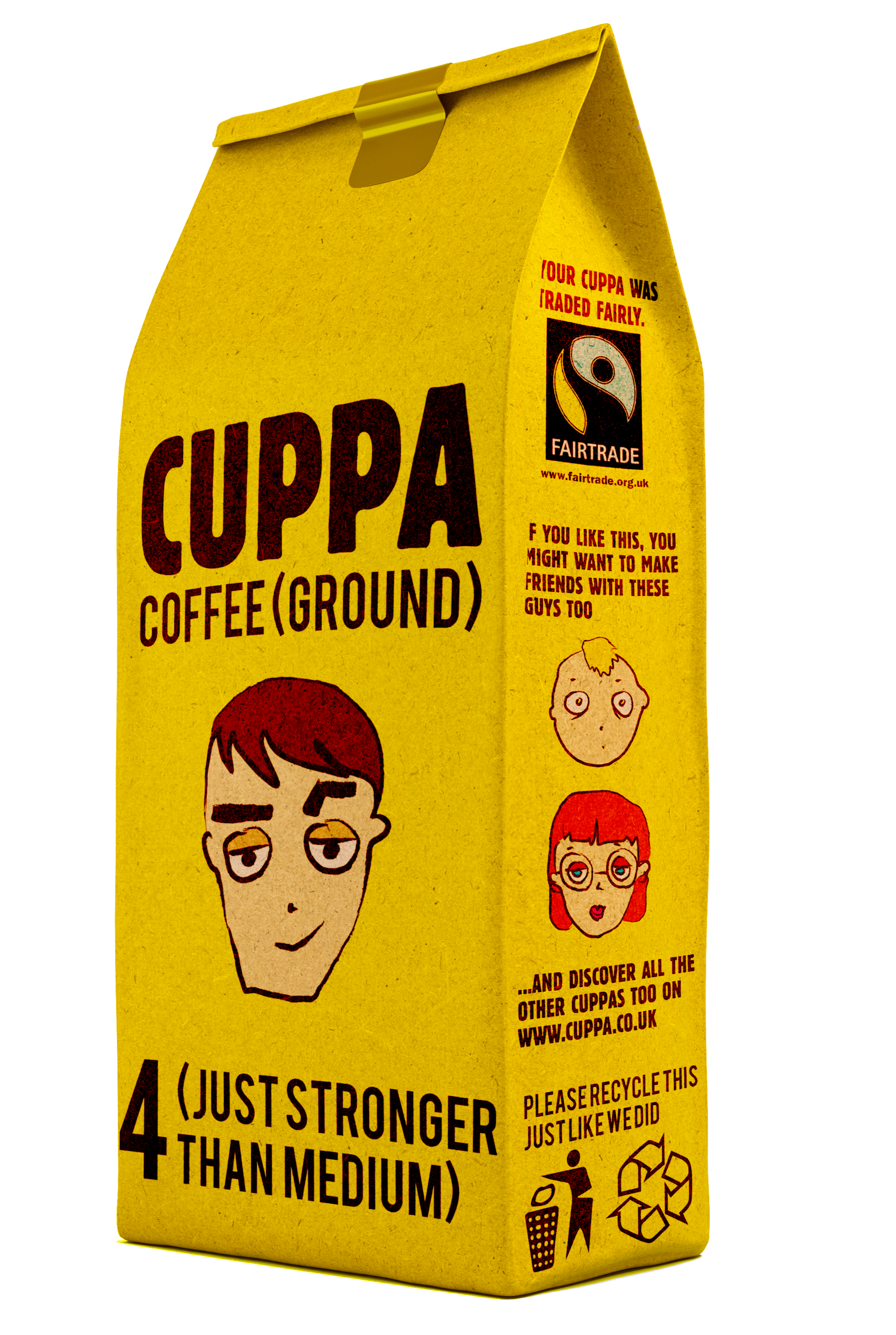
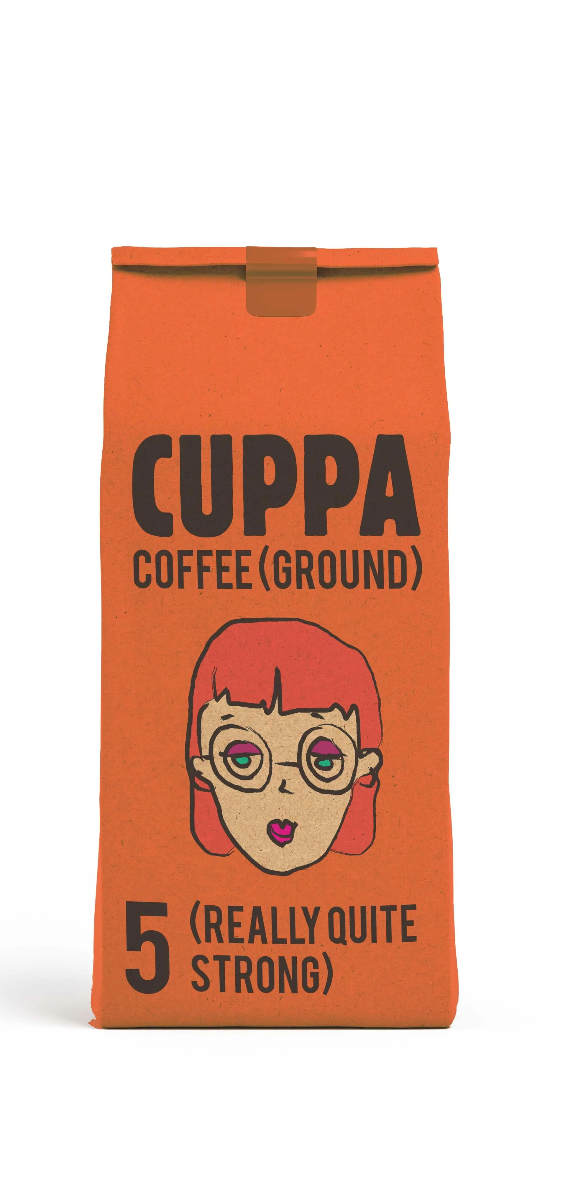
This was a commercial brief during my graphic design course. My idea was to create the branding of a new range of coffee and tea products, sold for young adults. I named it CUPPA and created an informal verbal and visual language to appeal to young consumers.
I decided to be very direct, giving a face to the product, with expressions associated to the effect and flavour of the drink.
They strengthen a friendly attitude to the product and make it instantly recognisable. I took extendability into account to make space for a wide potential range of products and I tried to make an environmentally friendly design as well by creating a fully recyclable cardboard pack.
My research on packaging designs has found that most of the words on tea and coffee packaging emphasise the health benefits, or the place of origin of the product, words such as “classic”, “pure”, “rich”, and “smooth” were associated with these products. I was looking for something different, a bold, direct language that was already in place on other products (shower gels, soft drinks), I aimed to bring this audience close to my coffee and tea range.