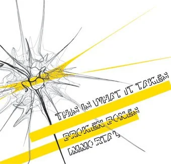
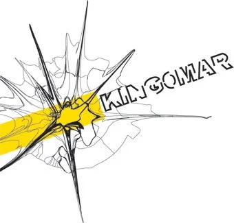
This font is a result of a minimalist experiment - I was curious about the minimum amount of lines that are necessary to read a headline text.
I had a few experiments with thin versions but they came out difficult to read. So I used a bold body with outlines instead. The result was this typeface which I used for a few projects, inlcuding for a band for their first EP - as a student I was keen to practice my design skills and I approached unsigned bands on MySpace to offer them artwork designs for free.