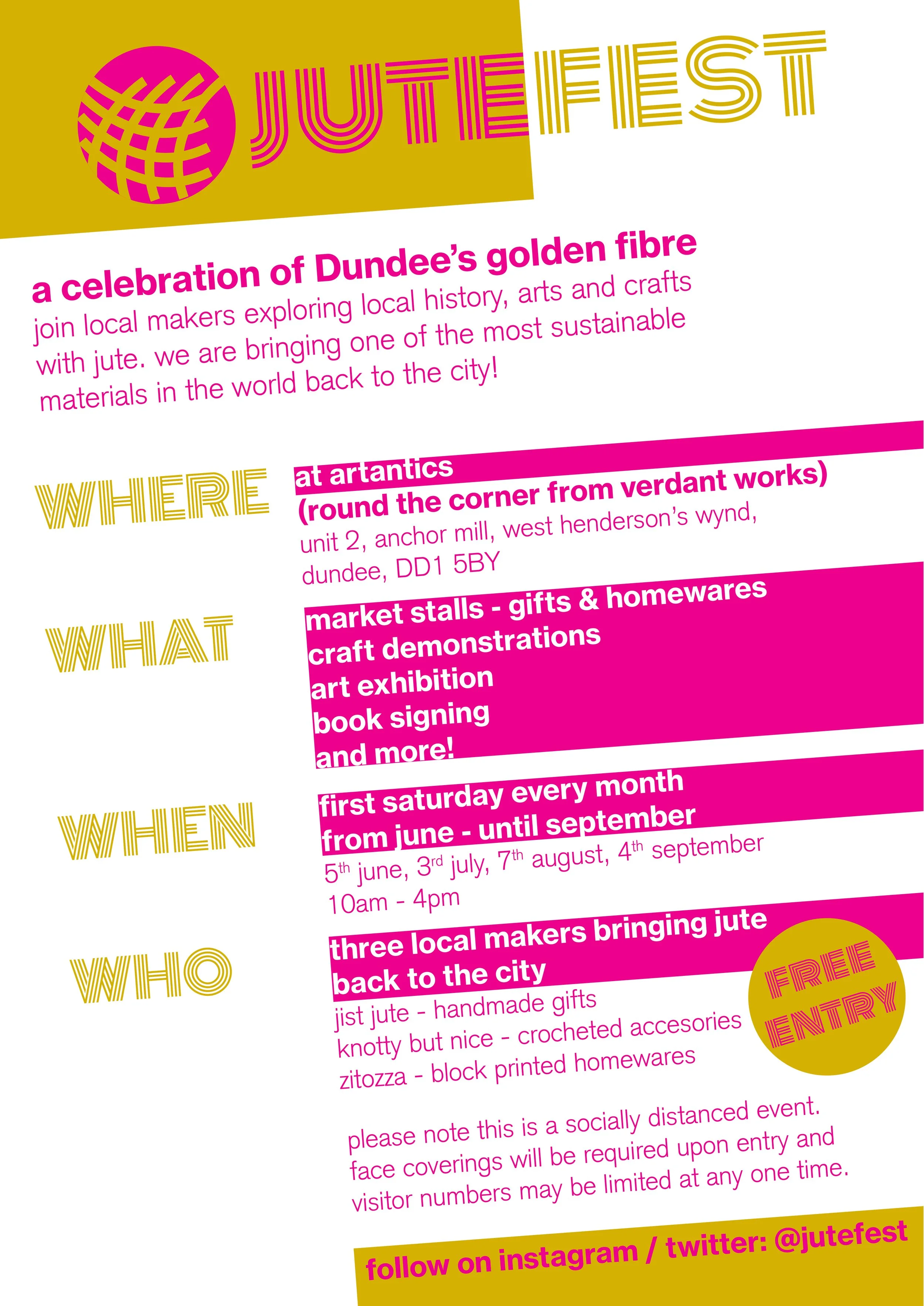
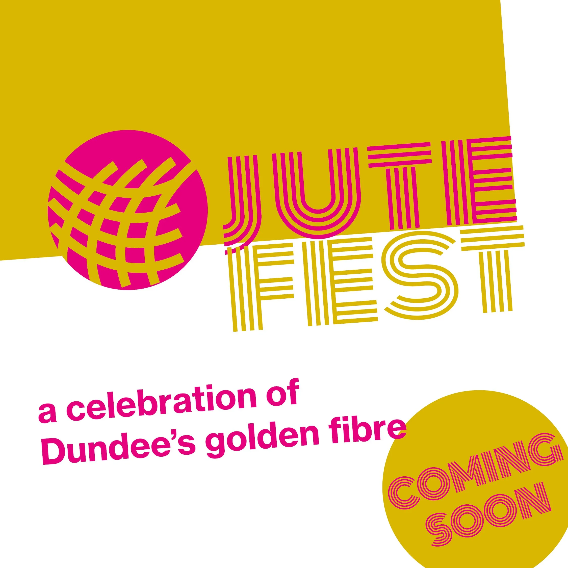
JuteFest was a series of events organised in Dundee by three micro-businesses, all using jute in different ways. The idea was to bring back and celebrate the "golden fibre” - much of what the city’s architecture was built around.
The events took place still under COVID restrictions - the gold in the design of course references the natural colour of jute, but the aim of the bright magenta colour reflects the desire to be bold and bright again.
The logo is a dynamic, flexible take on the woven texture and the Swiss font use is to emphasise the contemporary nature of the three creative practices organising the events.