This project is for a branded interior: Deep White Spa, a holistic wellbeing space in Iceland for the wealthy young traveller in need for a relaxing time. The term Deep White is not to be taken literally, it is a term for cleanness of the body and the mind, but it also refers to the richness of colours one can see in white when looking at the ice and the snow covered surfaces of the glacier surrounding this space.
it may seem contradictory to create a such a dramatic atmosphere in a space of healing and relaxation. however, the mood of an interior space - hospitality in particular - should be dictated by its environment, travellers want to be there for a reason. in this case, it is nature. iceland is a violent land with brutal forces at work, but it is what lends its healing power to the thermal baths too. therefore i see it something to be celebrated here.
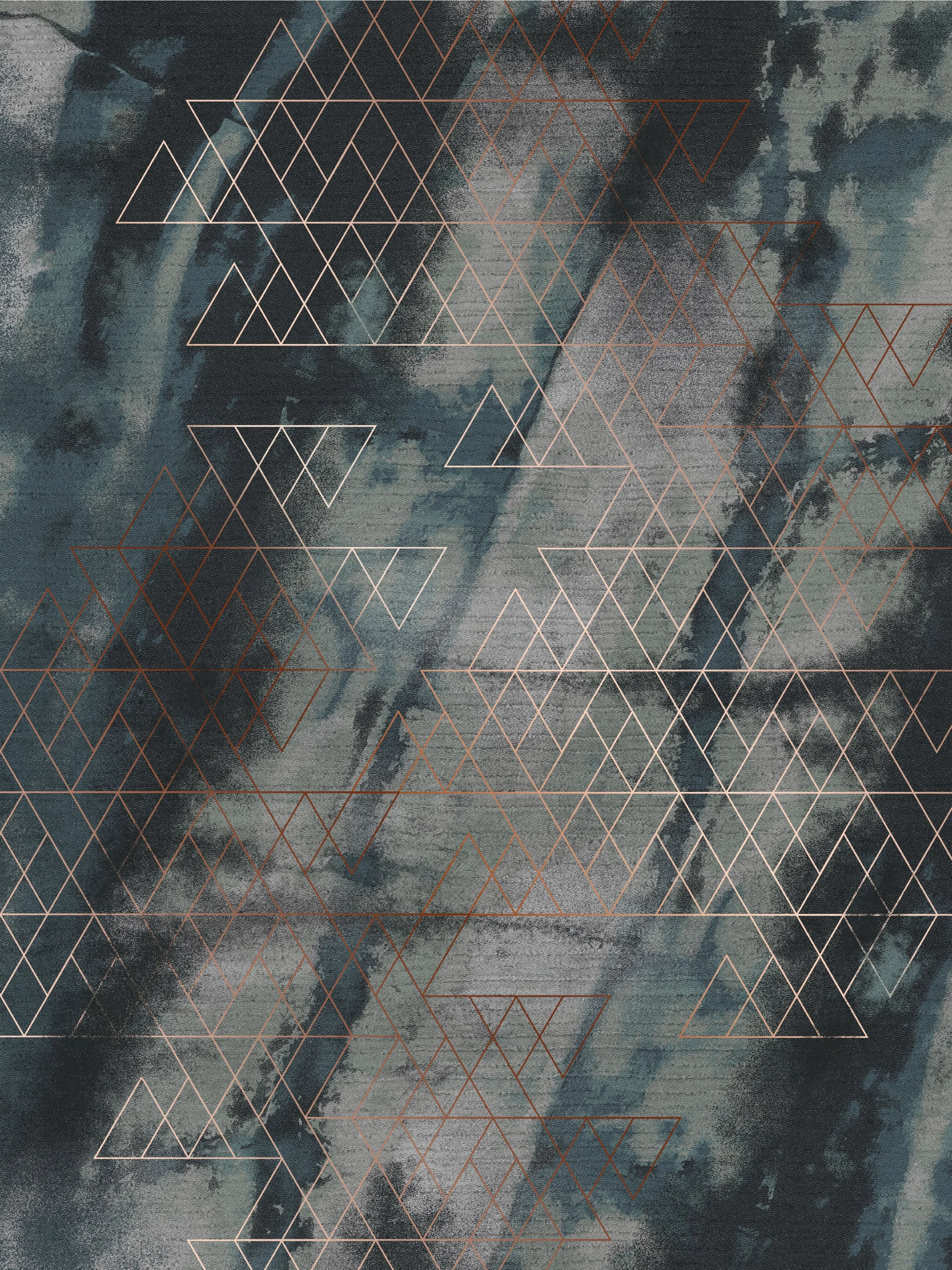
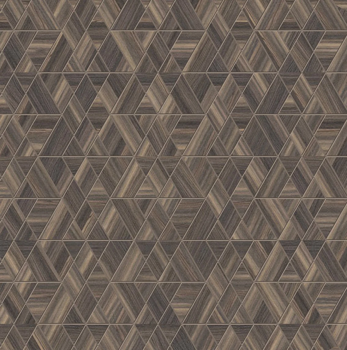
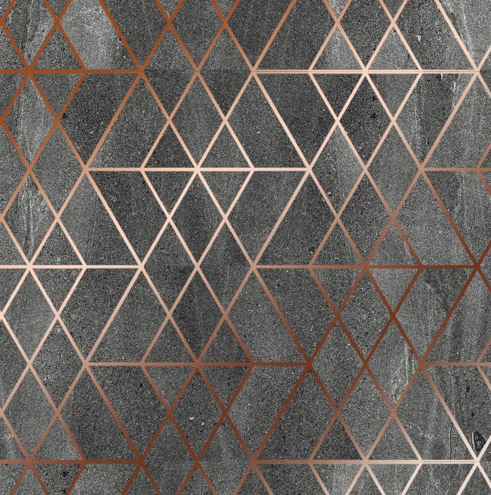
The logo is a simple take on the landscape, the letter “W”, and downward arrows to point towards the depths. It is an easily repeatable pattern that can be translated into many surfaces, such as the copper loop pattern on the lobby carpet, or the parquet and stone tiles.The materials used are also the product of the local natural processes, the wet area tiles are volcanic basalt and the wood surfaces in the treatment rooms are locally grown pine and black birch.
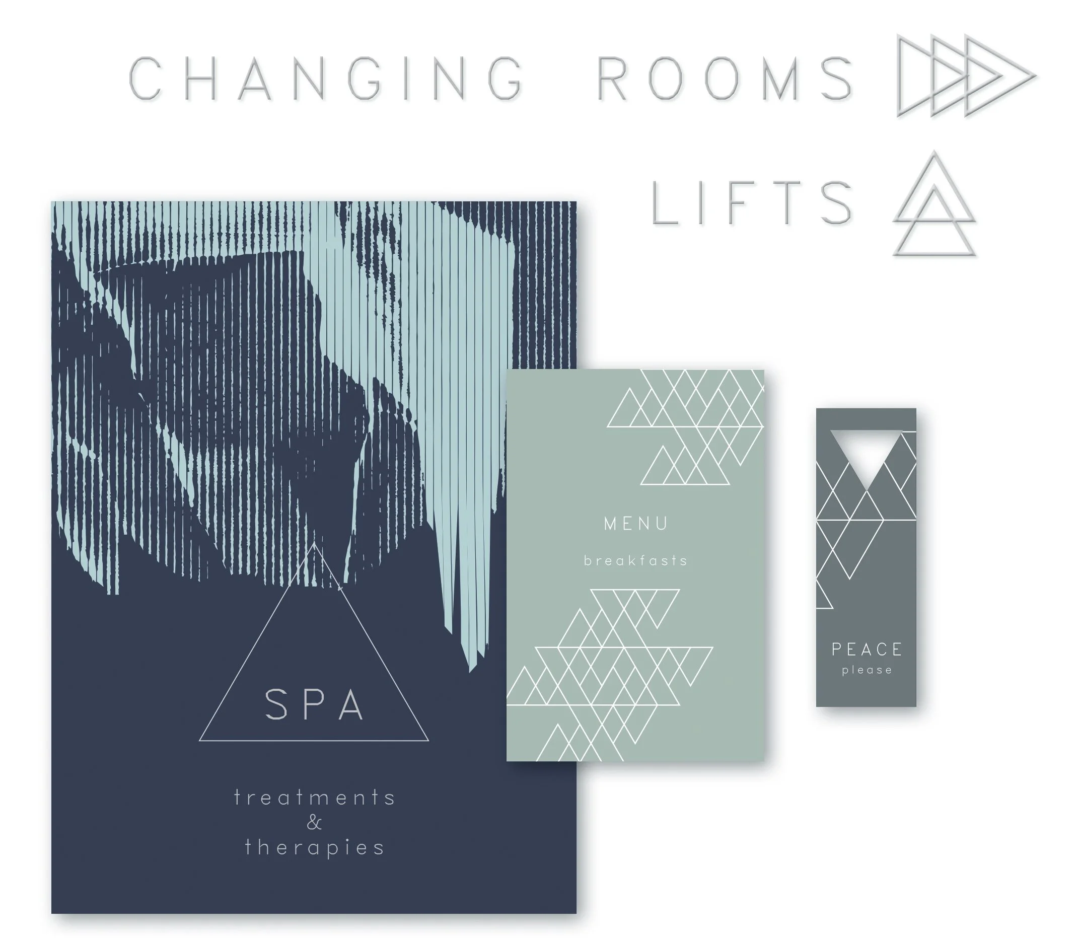
Brand elements are consistent throughout the interior details as well as the printed communication. The tiling of the walls and floors matches the logo and the signature floor carpet, and all the printed materials also feature colours originating from the reception carpet (previous page). The arrows for the wayfinding signage systems are reduced from the logo too.
Consistency of branding should never become predictable - while matching everything together to speak the same language, the role of textures and materials becomes enormously important here to provide interesting surfaces in order to break the monotony.