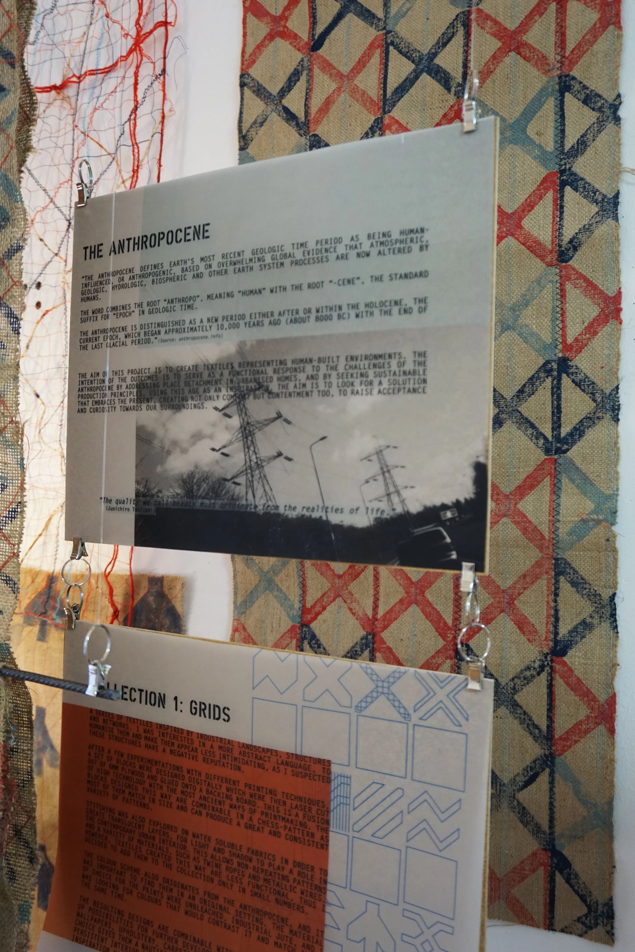
Anthropocene was the title of my MA project at Heriot-Watt University, and the project’s aims were the creation of textiles that are inspired by the human age.
The ultimate aim was to create interior textiles, to serve as a functional response to the challenges of the Anthropocene by addressing place detachment in urbanised homes and by seeking sustainable materials and production principles.
I intended to achieve this with three separate collection of textile designs:
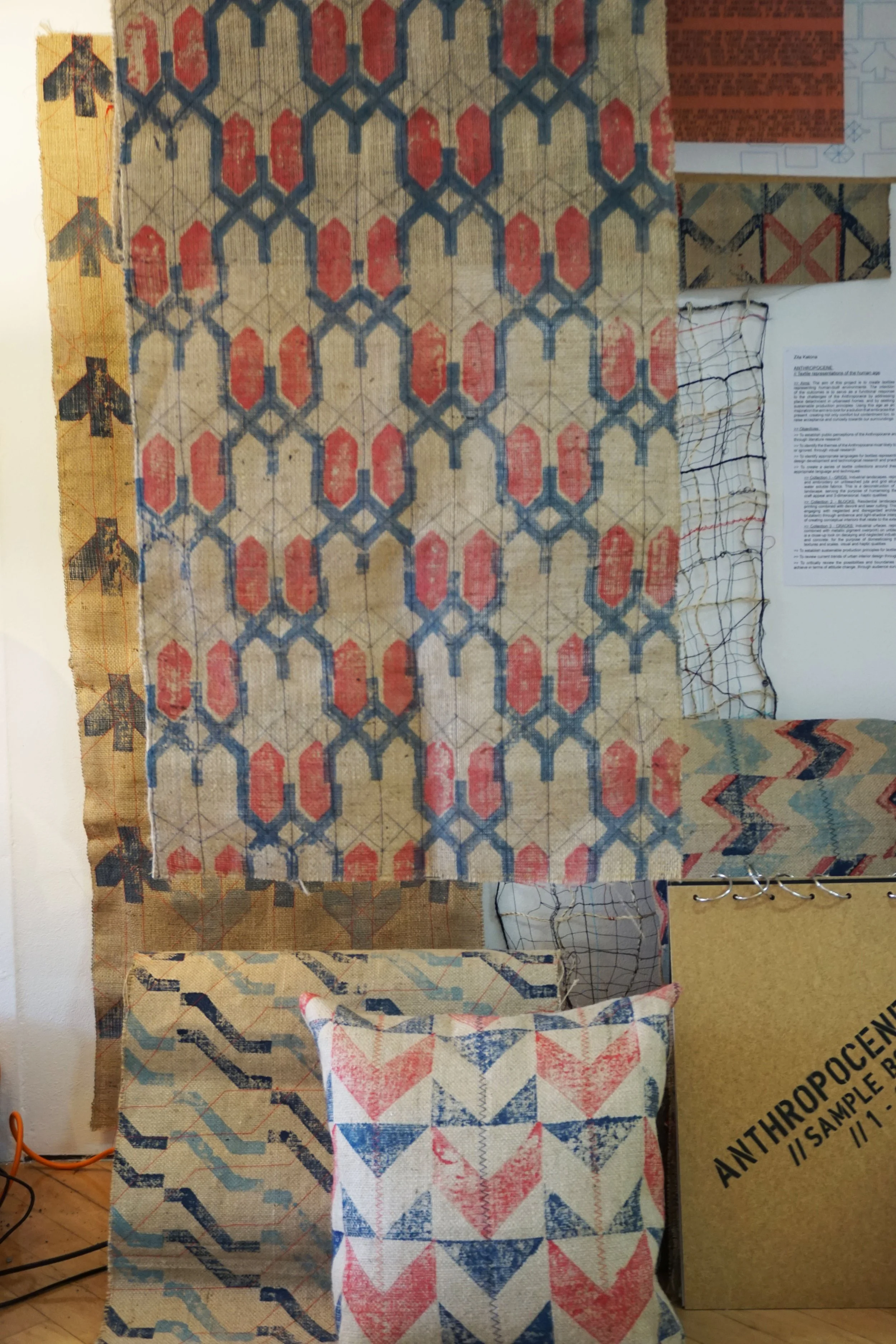
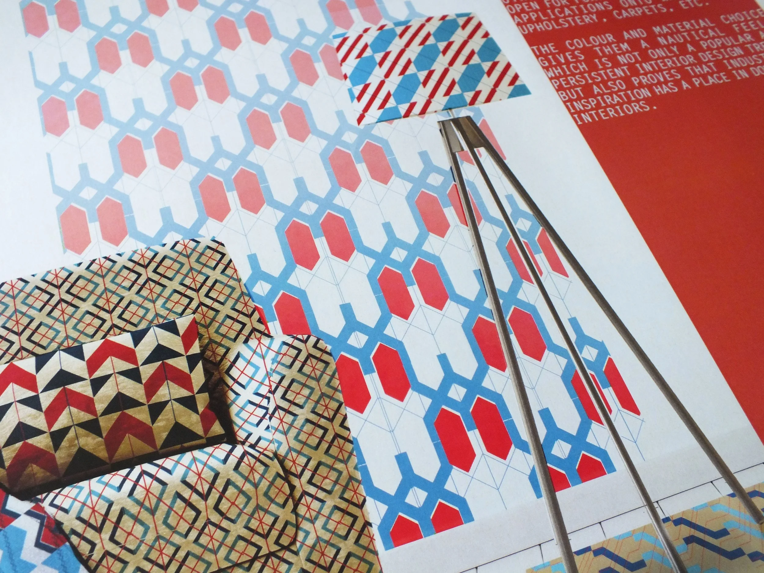
GRIDS is a series of textiles inspired by industrial landscapes, structures and networks. I was interested in an abstract language, to humanise them and make them appear less intimidating.
THEY ARE BLOCK-PRINTED WITH A SET OF DIGITALLY DESIGNED AND LASER-CUT BLOCKS, FUSING HIGH-TECH WITH THE MOST ANCIENT WAYS OF PRINTMAKING. THEY ARE ALSO OVERSTITCHED FOR AN ADDITIONAL HAPTIC QUALITY TO THE BASE FABRIC. THE PURPOSE OF USING ROUGH QUALITY JUTE IS TO SEEK SUSTAINABLE PRODUCTION PRINCIPLES AND MATERIALS AND ELEVATE THEM TO THE MODERN INTERIOR.
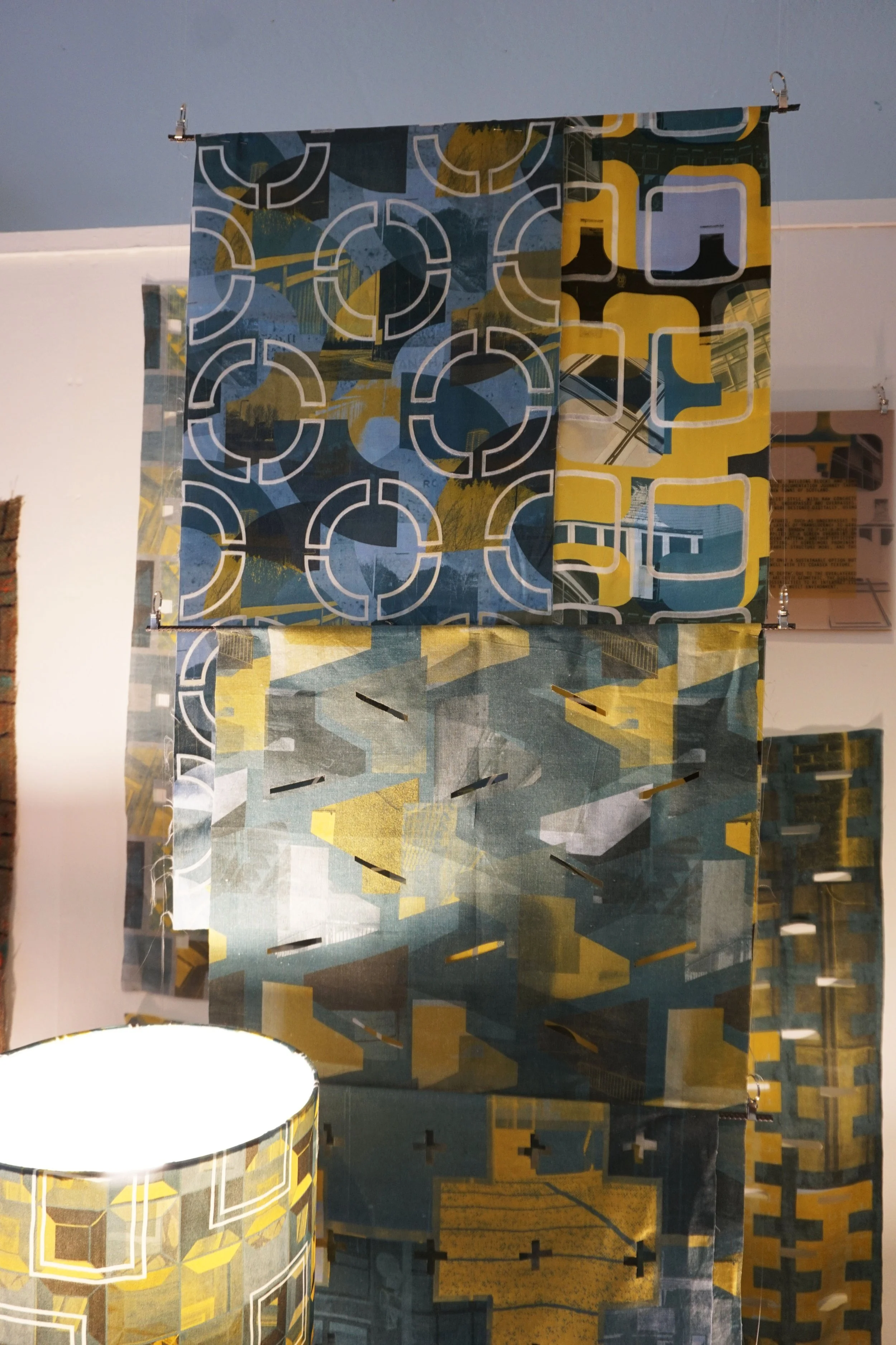
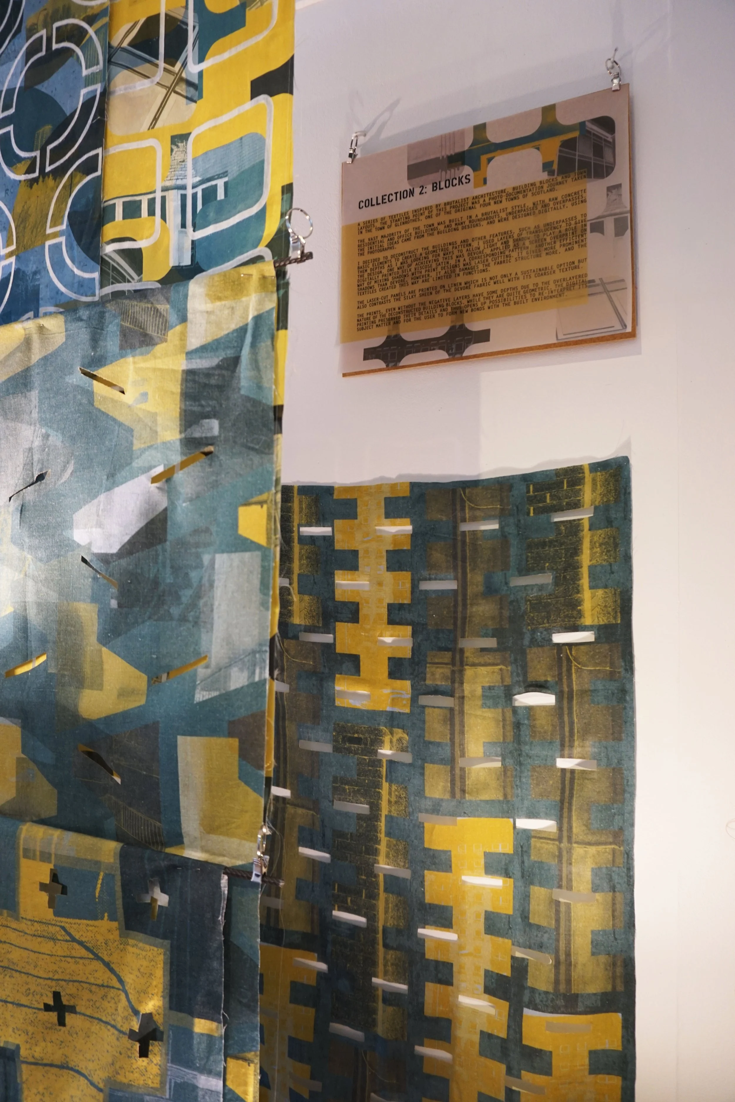
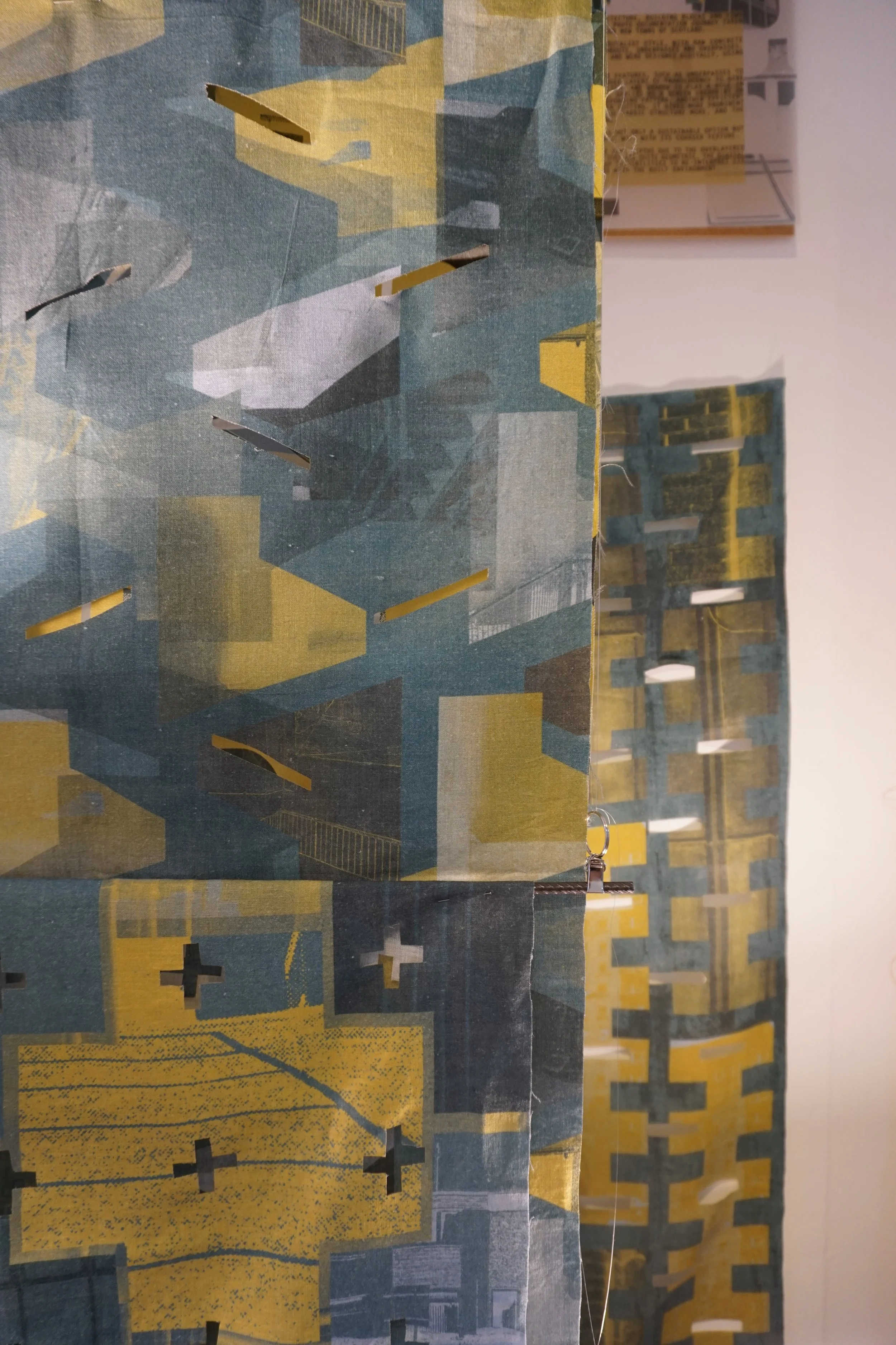
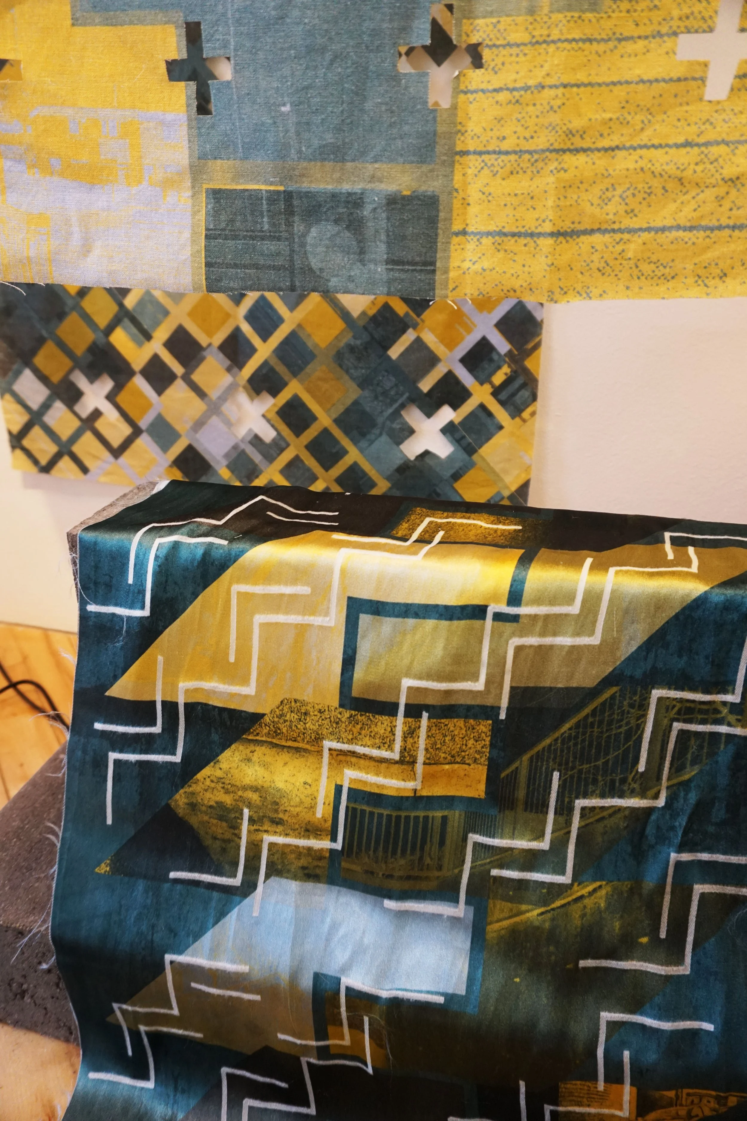
BLOCKS is a series of textiles inspired by brutalist architecture, building blocks and town layouts. I used Glenrothes, one of the original of the four new towns of Scotland, built mostly in a brutalist style, with raw concrete residential and office buildings, and many roundabouts, under- and overpasses.
I introduced negative layers as a means to allow light and shadow to play a role in the design. One way of achieving this was devoré, applied as a screen overprint on digitally printed silk viscose satin in a corresponding pattern. Another was laser cutting, which gives more prominent shadows than devoré.
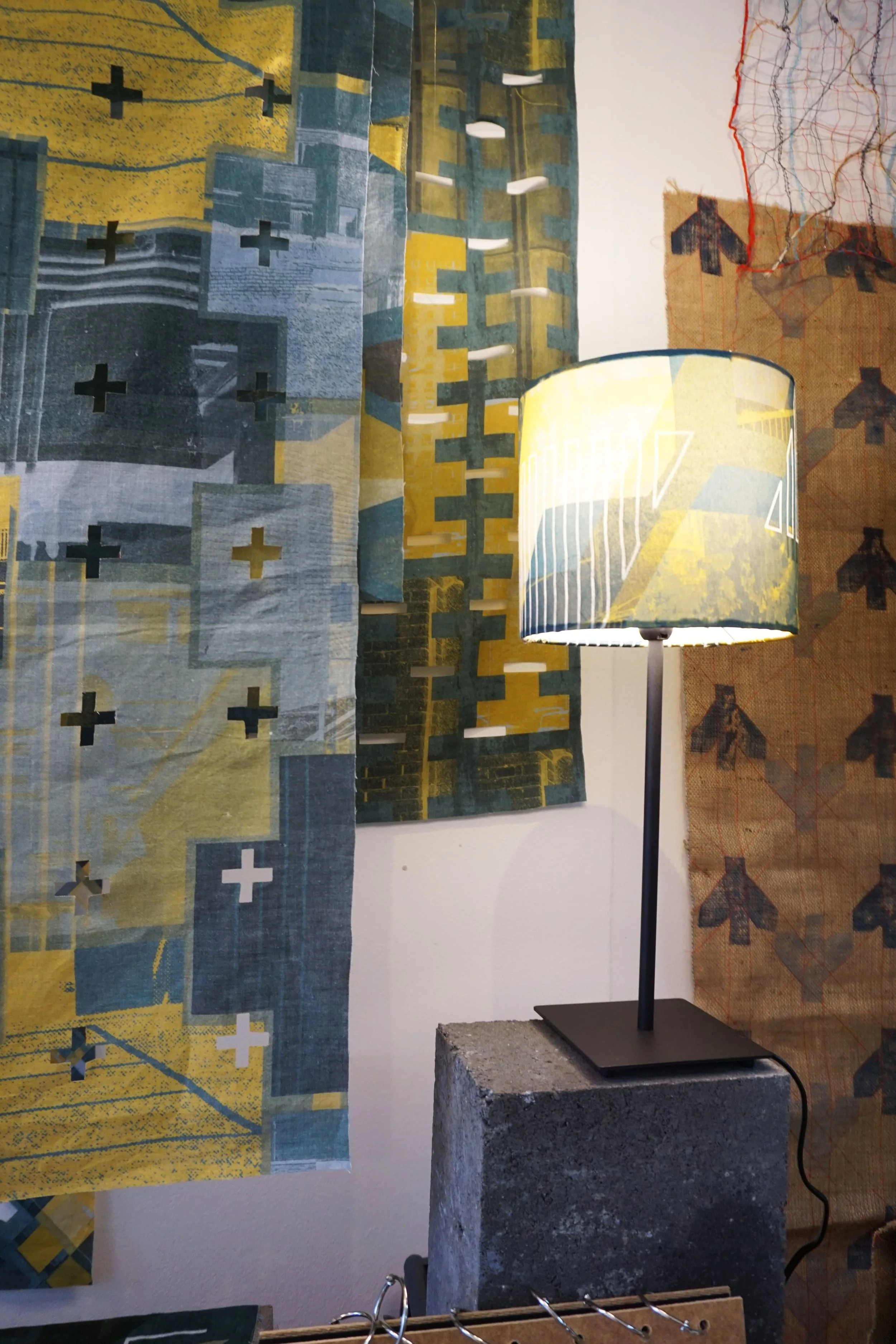
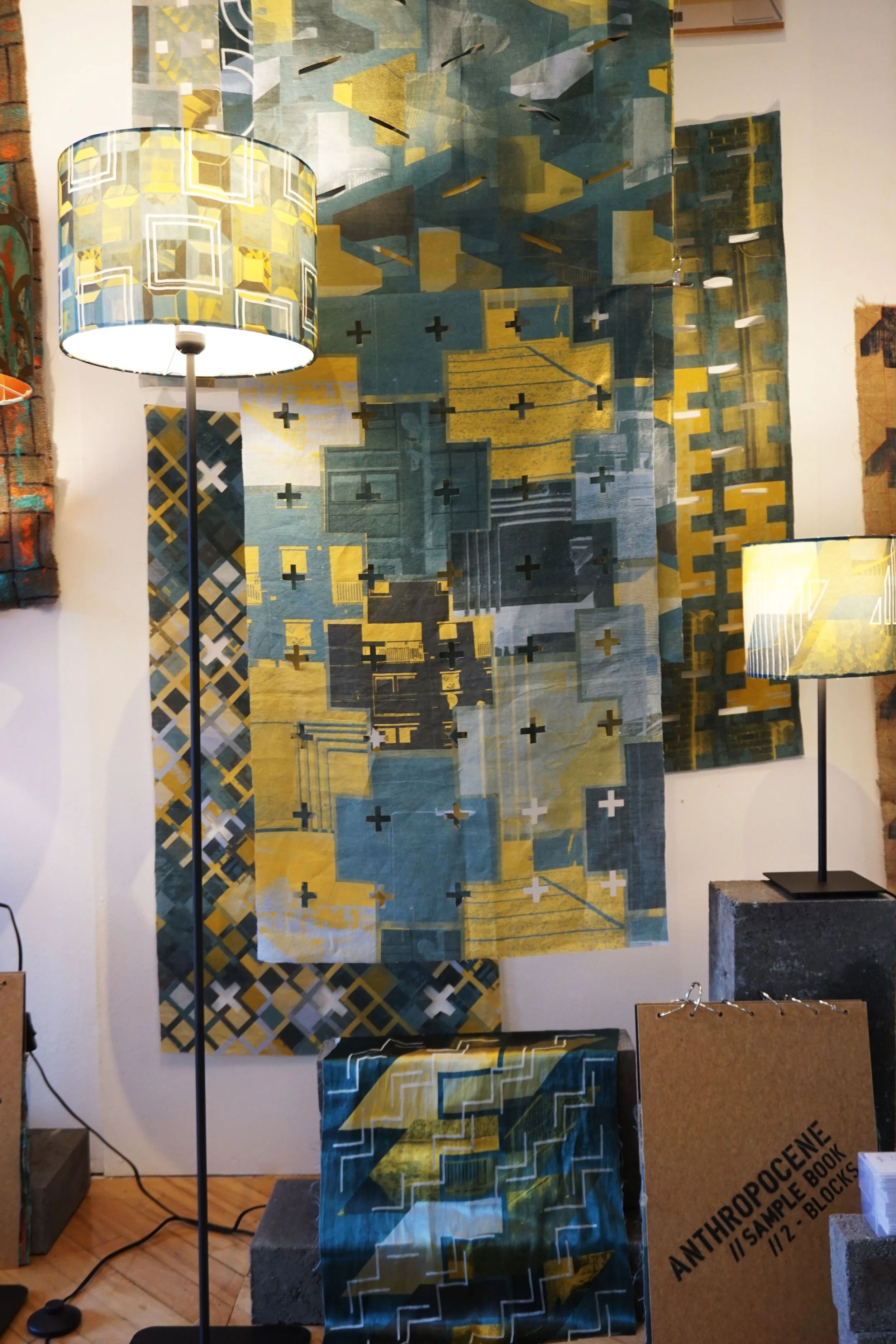
WHAT IS PRESENT IN ALL THREE COLLECTIONS IS ANOTHER VISUAL LAYER TO EACH OF THEM: WHETHER IT IS POSITIVE IN THE FORM OF EMBROIDERY OR OVERPAINT, OR NEGATIVE, AS CUT-OUTS OR BURN-OUTS, THESE ARE TEXTILES WITH DEPTH AND THESE ADDITIONAL QUALITIES CONNECT TO THE USER ON A MORE DIRECT LEVEL. THEY ARE NOT JUST PRINTS TO LOOK AT, BUT TO TOUCH, FEEL, MOVE AND RE-INTERPRET - USE.
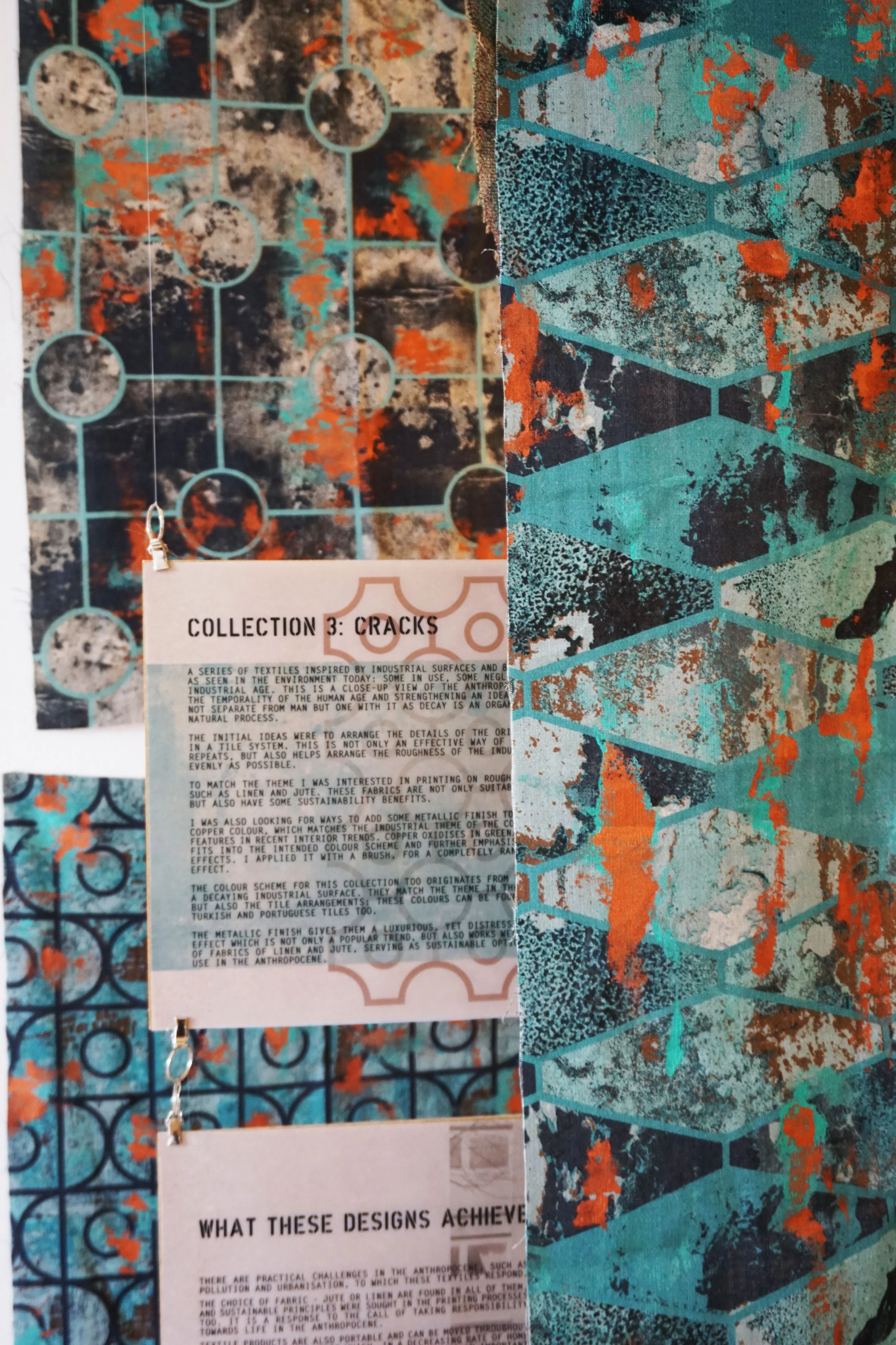
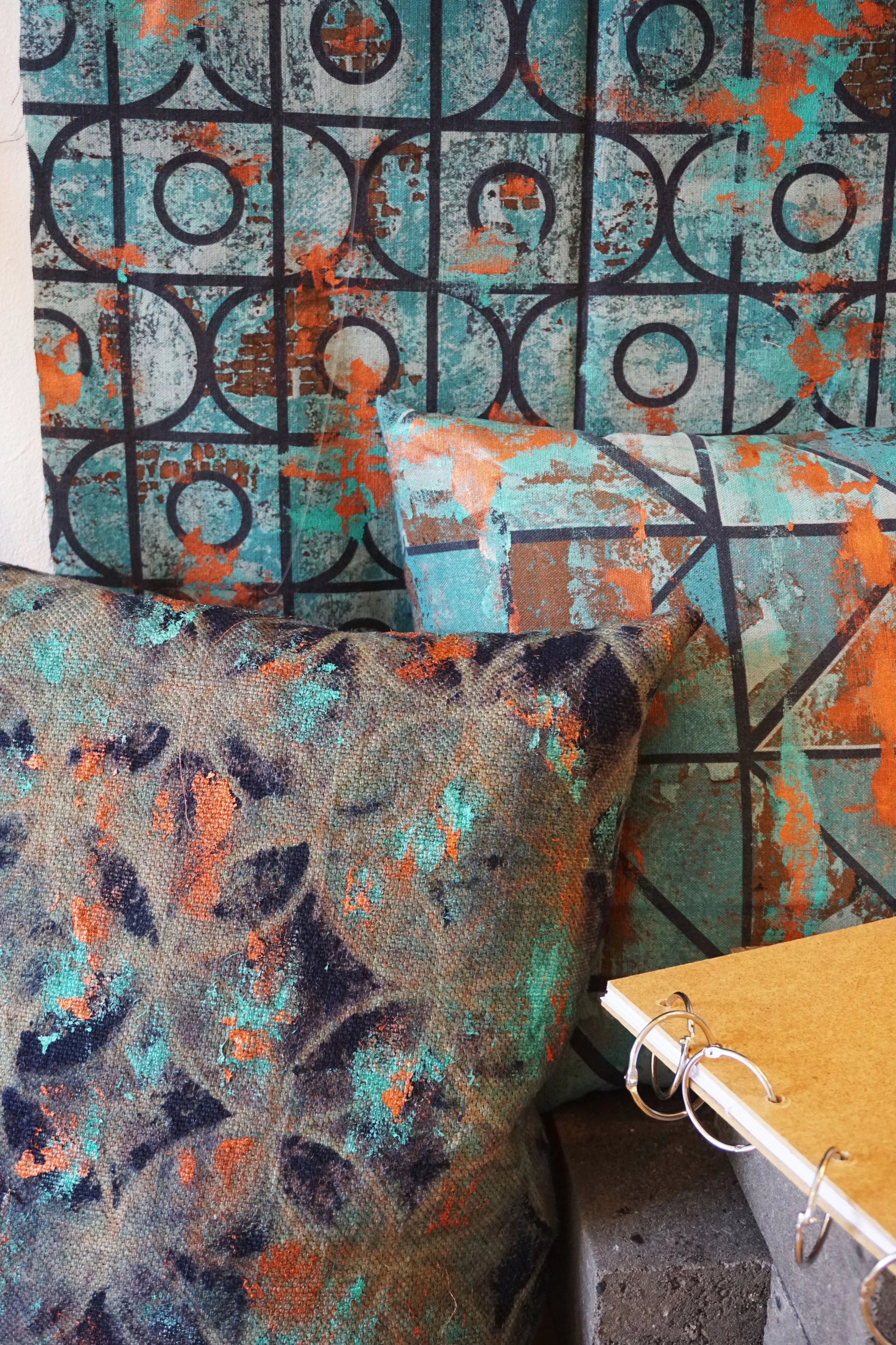
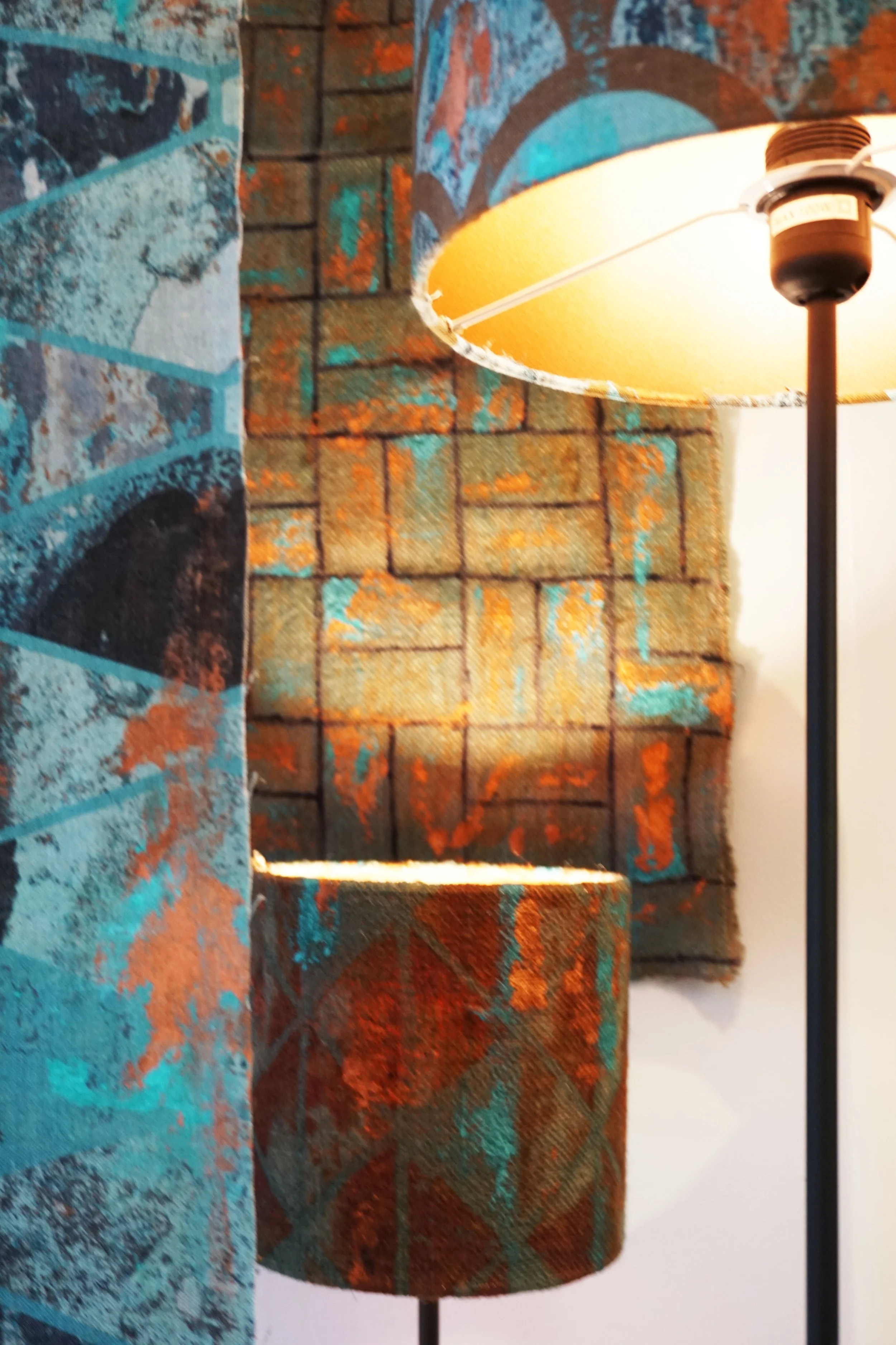
CRACKS is series of textiles inspired by industrial surfaces and building materials, as seen in the environment today: some in use, some neglected in a post-industrial age.
THIS IS A CLOSE-UP VIEW OF THE ANTHROPOCENE, EMPHASISING THE TEMPORALITY OF THE HUMAN AGE AND STRENGTHENING AN IDEA OF NATURE THAT IS NOT SEPARATE FROM MAN BUT ONE WITH IT, AS DECAY IS AN ORGANIC, UNCONTROLLED, NATURAL PROCESS.
Digital printing preserved the photographic details, but a metallic finish was introduced to the prints too, with copper colour. It matches the industrial theme of the collection and the colour scheme too: copper oxidises in green/blue shades which further emphasises the corroding effects. Applying it with a brush created a completely randomised, organic effect. The metallic finish also contrasts the coarse base fabrics well.