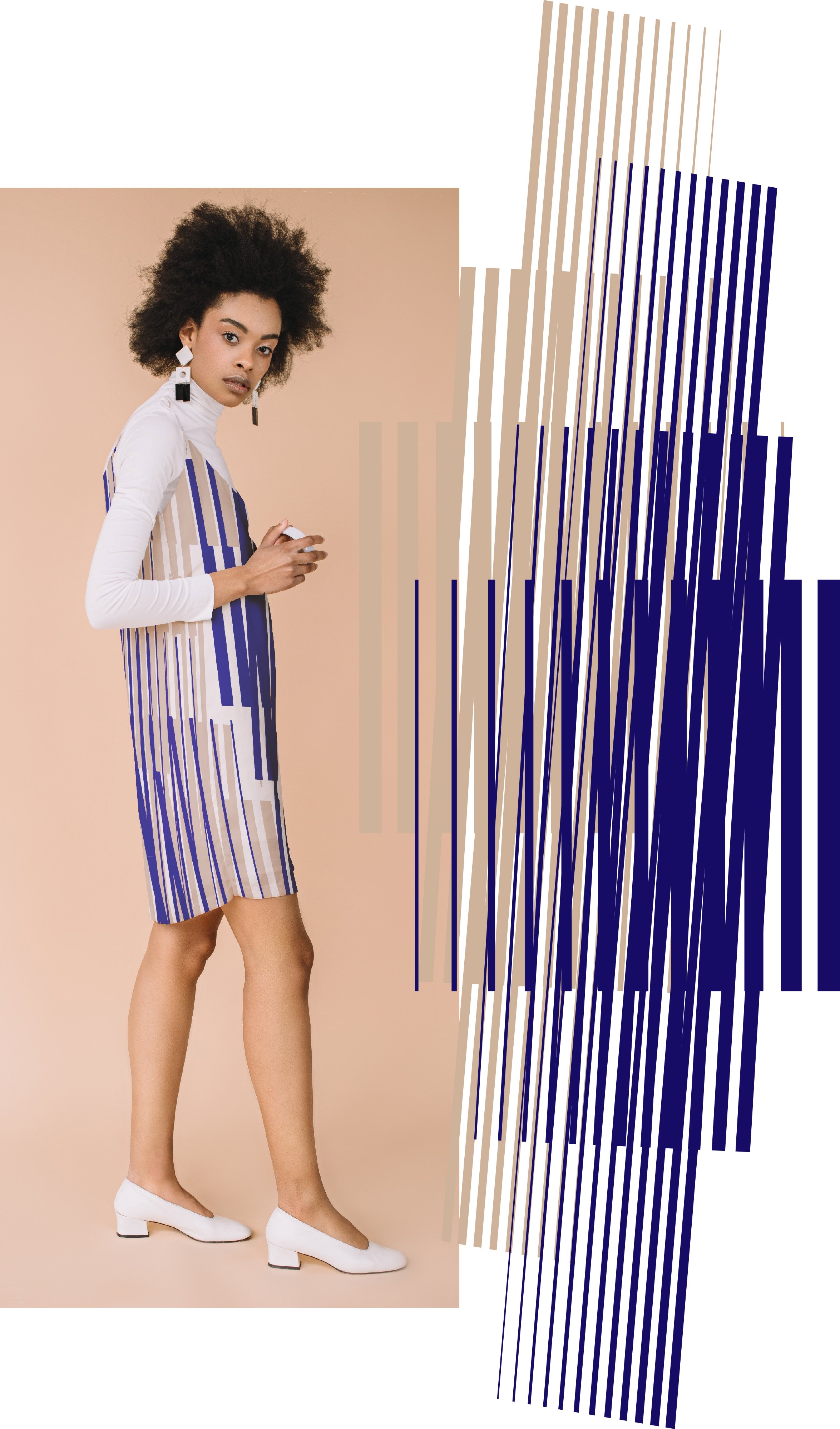
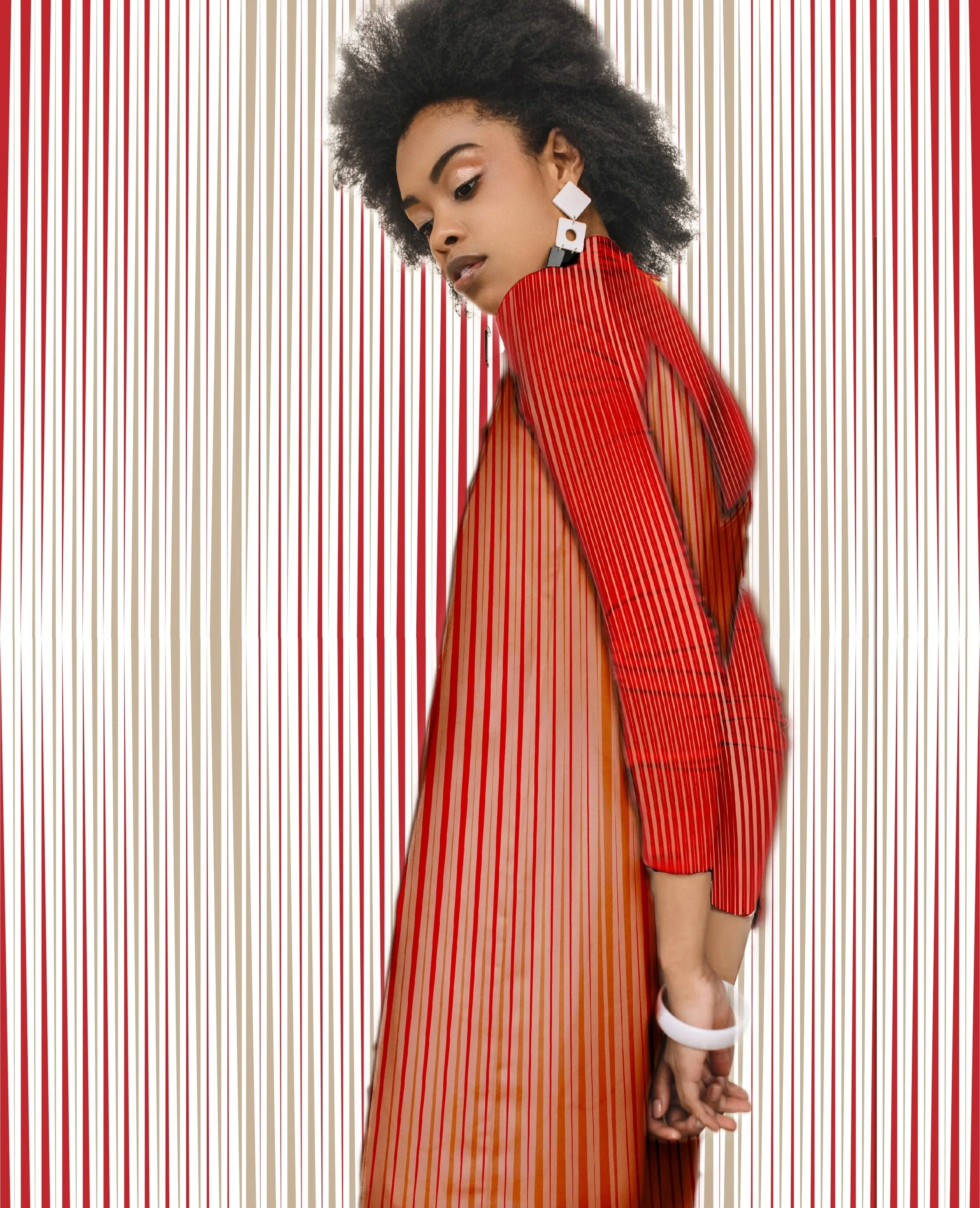
This is a small print collection sold with Print.One. I designed it while living in The Netherlands - Let Op! Is a Dutch phrase meaning “pay attention” or “look out”. I thought it can be a good word-game with op-art, an these prints also shout “pay attention” to their wearer.
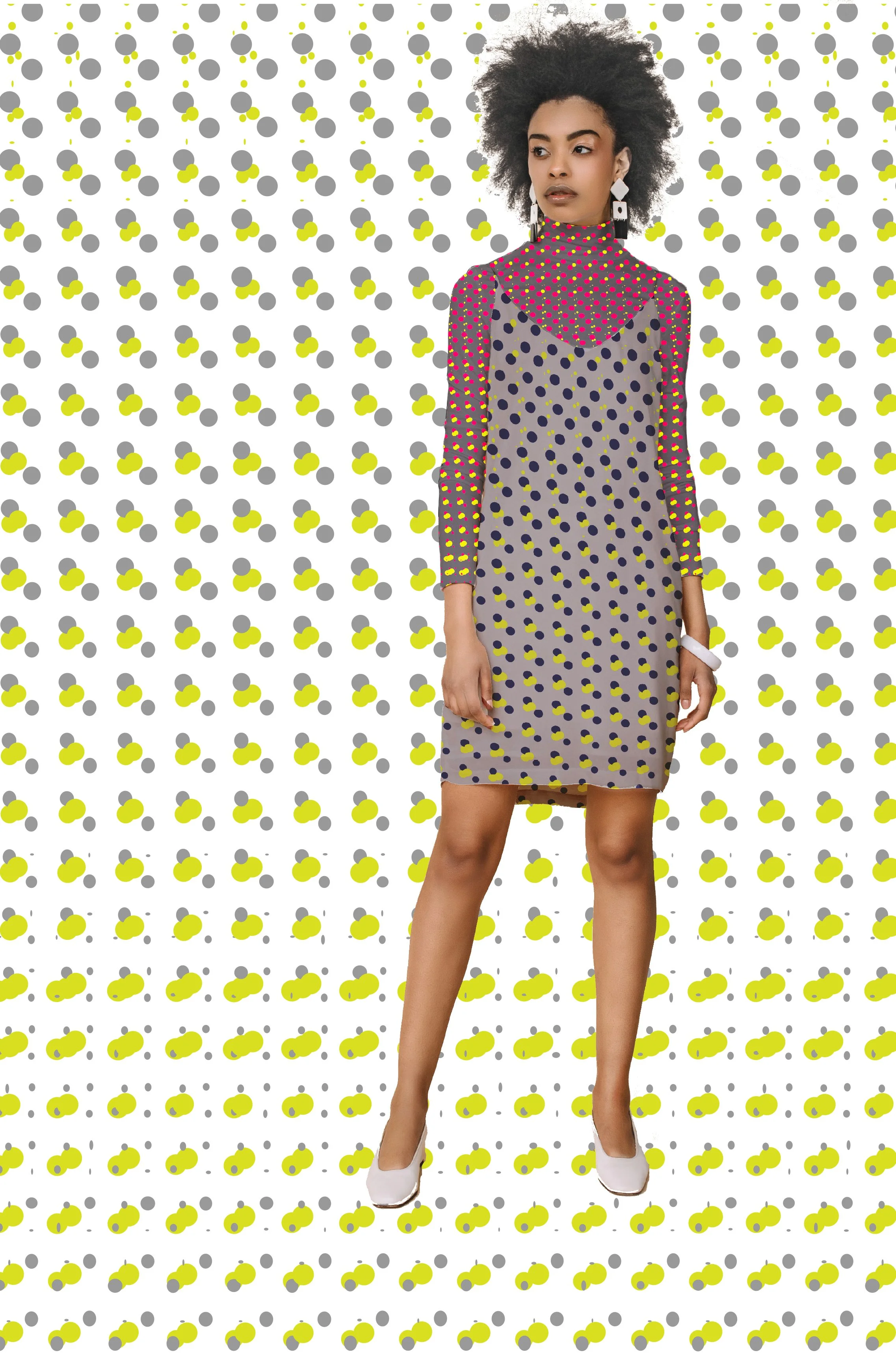
i have always been fascinated by op-art and when i saw the bold stripes and the polka dots in the trend forecasts for 2019-20, i immediately started working with a colourful theme to evoke optical illusions.
The prints are intended for womenswear and accessories, and the scales can vary to some degree to make a complete outfit or collection. While retro feels might be hard to avoid with a trend that was so popular in the 1960s, I tried to use contemporary combinations and colours that fit into the late 2010 - taking “instagrammability” into account too.