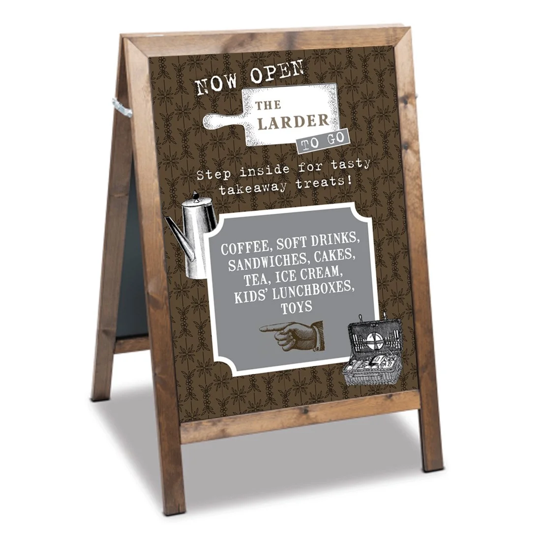
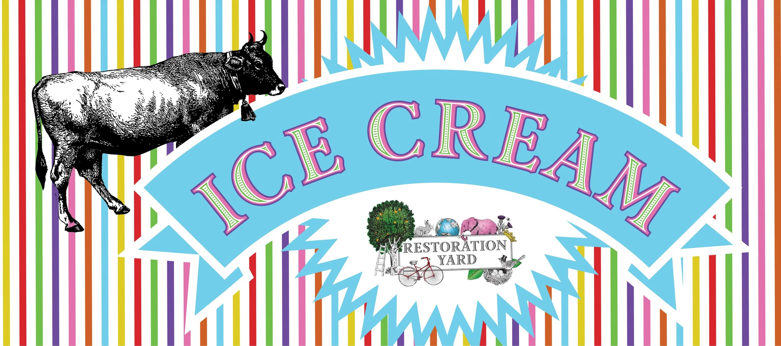
These designs were created for an outdoor visitor centre in Scotland, with several sub-brands, one of them called “The Larder”, with a nature-embracing interior decor, serving fresh, locally sourced food to go. All the existing sub-brands use the typeface and imagery of the umbrella: slightly traditional, but with a quirky twist with vintage style illustrations given a significant role.
Both the logo for the larder and the ice cream sign follows closely this visual guidance. the background patterns bring further consistency into the language, bringing together different functions for different targets.
The A-board is aimed at visitors of all ages in a more confined environment so more subtle colours were used, while the ice cream sign was to attract mainly children and young families. However, the visual language is common in both and achieves brand consistency throughout.